
Configurable Navigation
As a Foxtrot admin user, I can create and manage custom navigations for web application.
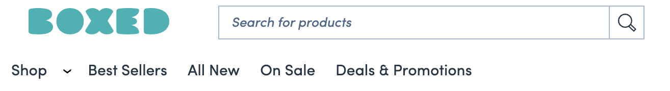
The configurable navigation feature allows users to control all links in the top display navigation, directly after and next to the ‘shop’ dropdown. See example below:
This feature allows organizations to manage what is displayed on their navigation and allows for segmented navigations for different user groups.
- Control the text displayed, order, color and landing links for each navigation placement.
- Configurable navigations impact Web + Mobile web only . This feature is not available for mobile apps.
To manage navigations, navigate to the Navigations page in Foxtrot.
- We recommend limiting access to this feature and limiting the amount of navigations created to reduce any potential user errors.
Navigation: List View
When a user navigates to the Navigation page, user sees a list view of all created navigations.
Priority: The priority order of the created Navigations. The priority order will control which navigation is displayed on site.GID: Unique identifier of the navigation. This is autogenerated upon saving the Navigation and can’t be changed.Name: The name of the Navigation set from the Navigation Builder tab- User can search by
Nameon the list view page
- User can search by
Targeting: User group the navigation is scoped to. Can either be “Global”, “Real Time User Segment” “User Segment” “Query Param” or “Multiple” based on what is set within the Targeting Tab.- If no segmentation is added, this will display “Global”
Status: The status of the navigation. Either enabled or disabled based on the status checkbox from the Navigation Builder tab.- A navigation must be enabled to display on site.
Navigation: Priority
Navigations are displayed on site by priority number. Priority goes from the lowest number to highest number starting with 0. 0 is the highest priority.
- If there are multiple active navigations for different segments, they will be displayed on site by priority. The lowest number takes precedence if a user falls into multiple segments of enabled navigations.
- Things to know/ best practices:
- Globally scoped navigations should be the lowest priority as a catchall (ie, 10)
- Most segmented navigations should be the highest priority to account for users in multiple segments (ie; existing users)
- Things to know/ best practices:
- User can drag and drop created navigations to change priorities on the list view screen. After dragging and dropping, user must press
Upate Prioritieson the top left of the list view screen. - When a new navigation is added in Foxtrot, the priority will default to #9999. Upon saving, this will update to the next sequential number.
Navigation: Create and Update
A user is able to create and edit navigations to display on web.
- A user can create a new navigation on the top left of the list view screen, or they can edit an existing one by clicking into the name.
Navigation Builder Tab
GID: Will be disabled until the navigation is saved. This is a unique identifier.Name: This is where the user enters the name of the navigation. Best practice is to include the targeted segment in navigation name for identification purposes.Navigation Status: Controls if the navigation is enabled or disabled. In order to appear on site this status box must be checked.
Navigation Builder:
- This section is where the specific links displayed in that navigation are set up. For each link within one navigation, user will need to
ADD LINKand enter all necessary information. Link Title: Text to display for that specific link within the navigation. Max 25 characters.Link Type: Either URL or Soft Category. This is the type of link that will open when user clicks on the navigation.- Once selected,
Link Referencewill appear. This is where the user will add in the exact URL or search for the existing Soft Category.
- Once selected,
Color: Hex code field to choose or enter the color to be displayed for that link in the navigation.- If added, color will override the default text color for their organization.
- If nothing is entered, the default text color from style guide will display.
- Color will never impact the hover state, this will not be customizable.
Icon Type: User can select eitherSquare Icon (18x18)orRectangle Icon (20x16)to upload an image that will display to the left of the title. This will also be clickable to the URL.- Upon selecting either option, a
PNG Imagefield will display where users will upload the icon image.- For navigation icons, we suggest using a SVG file as a base for producing the PNG, as that should produce a high quality version at 20x16 or 18x18. Images should be scaled up in the SVG before exporting as a PNG so they can remain less than 1KB.
- User’s do not need to add an icon, but if
Icon Typeis selected, Image field is required. - Things to know:
- Web will force resizing down to the selected size if incorrect size is uploaded.
- Upon selecting either option, a
Custom ID: This field should only be used for navigation links that are hard coded on web. Customizations will only render if client-side app has hardcoding that matches the Custom ID.- This is only used if enabled for your organization. Most likely, a user will not fill in this field.
- While within the navigation builder, user can drag and drop the individual links to control the order in which they will display within that navigation from left to right.
- User will not be able to add additional links until the previous link is filled out with all required fields.
- User can add up to 10 links total in each navigation.
- Pressing
DELETEon the bottom of each link will remove the link entirely, including all associated details. - User’s can add new or edit existing details and save on the top left of the page.
- User’s can only delete a navigation if there is another active navigation set up.
Targeting Tab
This is where you can target navigations to specific user groups. If no segments are included, the navigation will be globally scoped.
- If there are multiple active navigations for different segments, they will be displayed on site by
priority. The lowest number takes precedence if a user falls into multiple segments of enabled navigations.
Target navigations by Includes Segment or Requires Segment rules:
Includes Segmentcaptures users who meet any of the segment criteria.- Use
Includesif combining multiple segments where users only need to meet one or another of the segment criteria.
- Use
Requires Segmentcaptures users who meet all of the segment criteria.- Use
Requiresif combining multiple segments where users need to meet all of the segment criteria.
- Use
- For this feature, you can only use
IncludesorRequires. Our system disables the other section if you start inputting in one section.
Targeting options:
Real Time User Segments: Search for existing Real Time User SegmentUser Segments: Search for existing User SegmentQuery Params: Enter an existing query paramisNewUser= for customers who have not yet made a purchase (includes guest users)isExistingUser= for logged in customers who have at least one purchaseshowBusinessView= for business users. This can be combined with user query params, such as isNewUser or isExistingUser.- The business query param is only available if B2B is enabled for your organization.
Updated over 1 year ago