
Pages
As a Foxtrot admin user, I can create and manage custom pages for web application.
To manage pages, navigate to the Pages page in Foxtrot.
Overview
- Pages is where you can create custom pages such as homepages, landing pages and brand pages to be used on your website. These are configurable pages built using different content modules. Overviews of those modules can be found in this guide.
- Pages can be segmented to different user groups. Pages can be accessed directly or can be linked to from other components of your website.
- Pages are web view only. It is important to note that if a custom page URL is opened from your iOS or Android app, it will open a web view of that page. When opening a web view, user information isn't passed from the app, so it is as if they are viewing as a guest user and user segmented content or pricing will not display.
Pages: List View
When a user navigates to the Pages page, user sees a list view of all created pages.
- The list view will default to a result view of
Activepages GIDis the unique ID of the pageSlugis the URL slug of the pageNameis the internal name a user can give for the pageStatusindicates the status of the pageSegmentwill show if the page is scoped to specific segments or default to all customersStart DateandEnd Dateshows the dates the page is live and accessible by customersConfig Typeshows the type of page it is
Search and filter by the below fields to view a select page:
- User can search by
Slug. Search is case sensitive. - Search and filter by
Config Type - Search and filter by
Status - Fields can be used together to narrow down your results
Pages: Config Types
A user is able to create different types of pages. See below for all page config types.
- Depending on the config type, the page slug will be different.
- Home Page:
- Modular page displays when a user lands directly on your website.
- Slug:
/eg:website.com/
- Landing page
- Modular page used for marketing or content purposes.
- Slug:
m/nameeg:website.com/m/blackfriday
- Brand page
- Modular page used to highlight a select brand.
- Slug:
brand/ID/nameeg:website.com/brand/10/pepsi
- Blog page
- Modular page used for blog posts.
- Slug:
blog/nameeg:website.com/blog/coffee-recipes
- 404 page
- Modular page used for broken web links or errors.
- Slug:
/404eg:website.com/404
- Text Content Page
- Text content page used for T&Cs and policy pages. This page type supports text formatting using Markdown language.
- Slug:
/teg:website.com/t/terms
- Product Display Page
- See Configurable PDP user guide for this feature
- Slug:
/pdp
- Mobile Shop Tab
- See Mobile Shop Tab user guide for this feature
- Slug:
/mobile-shop-tab
- Mobile App Homepage
- See Mobile App Homepage user guide for this feature
- Slug:
/mobile-app-homepage
- Home Page:
Pages: Create and Update
A user is able to create and edit custom pages for web application. The below guide applies to all config types except Product Display Page and Mobile Shop Tab. See Configurable PDP and Mobile Shop Tab user guide for details.
Page Builder Tab
Properties:
- Set
Start DateandEnd Dateto configure how long the page will be live for. Page must be within the start and end date to be visible.- If multiple pages overlap in time and target, the later start date will take priority.
- Check
Enable Pageto activate the page. If this is unchecked, the page will not be live.
Buttons
- Configure default text colors and background colors by hex code for all CTA buttons applicable for the modules on the page
- When adding hex codes, click into field, add code, and press enter
Content Builder
- Configure page layout by clicking
Add Rowbutton- If necessary, click left side bar icon to configure columns from Single to Two
- Homepages do not allow configuring column layout. These must be single column.
- Text Content Page only allows Markdown Text Block
- Add modules into the row by clicking
Add Moduleand selecting modules from dropdown. After selecting a module, pressEditon the top right of the row to populate all module fields. - See guides for specific modules below in this user guide.
Targeting Tab
Pages can be targeted to desired customers by utilizing segmentation rules.
- If there are multiple active pages for one segment, users will see the page with the most recent start date.
Includes segments: Includes any customers that fall into these rules so they can see the page.- Use
Includesif combining multiple segments where users only need to meet one or another of the segment criteria.
- Use
Require segments: Requires customers to fall into these rules so they can see the page.- Use
Requiresif combining multiple segments where users need to meet all of the segment criteria.
- Use
- Targeting options:
- Target pages by user segments. See user guide for User Segments
- Target customers by location groups. See user guide for Location Groups
- Target customers by UTM Campaign. See user guide for Campaign URL Builder
- Target customers by Query Params:
isNewUser= for customers who have not yet made a purchase (includes guest users)isExistingUser= for logged in customers who have at least one purchaseshowBusinessView= for business users. This can be combined with user query params, such as isNewUser or isExistingUser.- The business query param is only available if B2B is enabled for your organization.
Keywords/SEO Tab
- Add desired SEO for your page on this tab.
- Title: required, max length of 60 characters
- Site search keywords
- SEO description
- The meta description should come from this field, but if nothing is filled out, it will take the first description it can find in the page source.
- SEO keywords
- SEO meta image
Guides for Modules
Carousel Module
Below is an example of the carousel module:
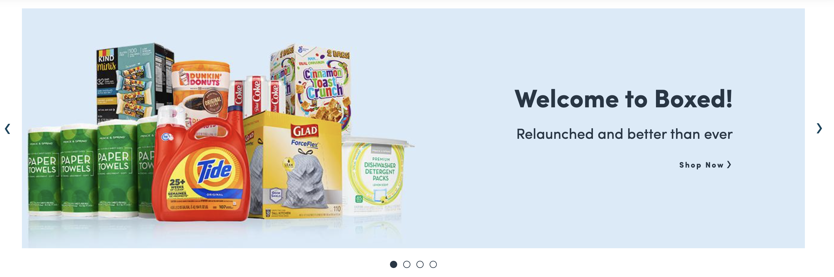
The Carousel module is only eligible on homepages.
Carousel Module: Configuration
To configure, add a row in the the Content Builder section of the page and select Carousel. Click in to edit.
Steps:
For all slides in the carousel:
- Add add as many slides as needed. Only the slides with a
Status= enabled will be shown on site - Drag and drop the slides in order of how each slide will show on site
- Select
slide duration(in seconds) which controls how long each slide will stay before transitioning to the next slide
For each individual slide:
Start Date+End Date: Slide will appear if both dates are left blank. Add dates if the slide should only appear during a select timeframe.Status: Must be enabled for the slide to appearImages: Upload Desktop + Mobile imagesAlt Text: Used for voiceover. Can be the same as the Header Copy.Text Justification: Position placement for the text. Choose based on the image layout so text does not overlap.- Add
Header+SubheadCopy Headers Copy Color: Hex code color of the header and subhead copy- Add
CTA Copy CTA Type: Choose type of link for CTACTA Reference: Search and select reference. If you chose URL as CTA Type previously, inputting full link will open a new tab. Putting in partial link after/will open in same tab.CTA Copy Color: Hex code color of the CTA copy- Press apply and save
Carousel Module: Image Asset Guide
- Desktop: 1400px width x 400px height
- Mobile: 716px width x 424px height
- Final Files: JPG or PNG
- Note: Main text should not be added into creative. It should always come from the copy fields.
- Carousel images are compressed to 150kb. If the image uploaded image is > 150kb, you may notice a difference in quality.
- To avoid this, you will need to optimize these images to reduce file size without compromising image quality. Some ways this can be done is by using JPEGs instead of PNGs, and also removing metadata from images.
Personalized Module
Below is an example of the Personalized Module:
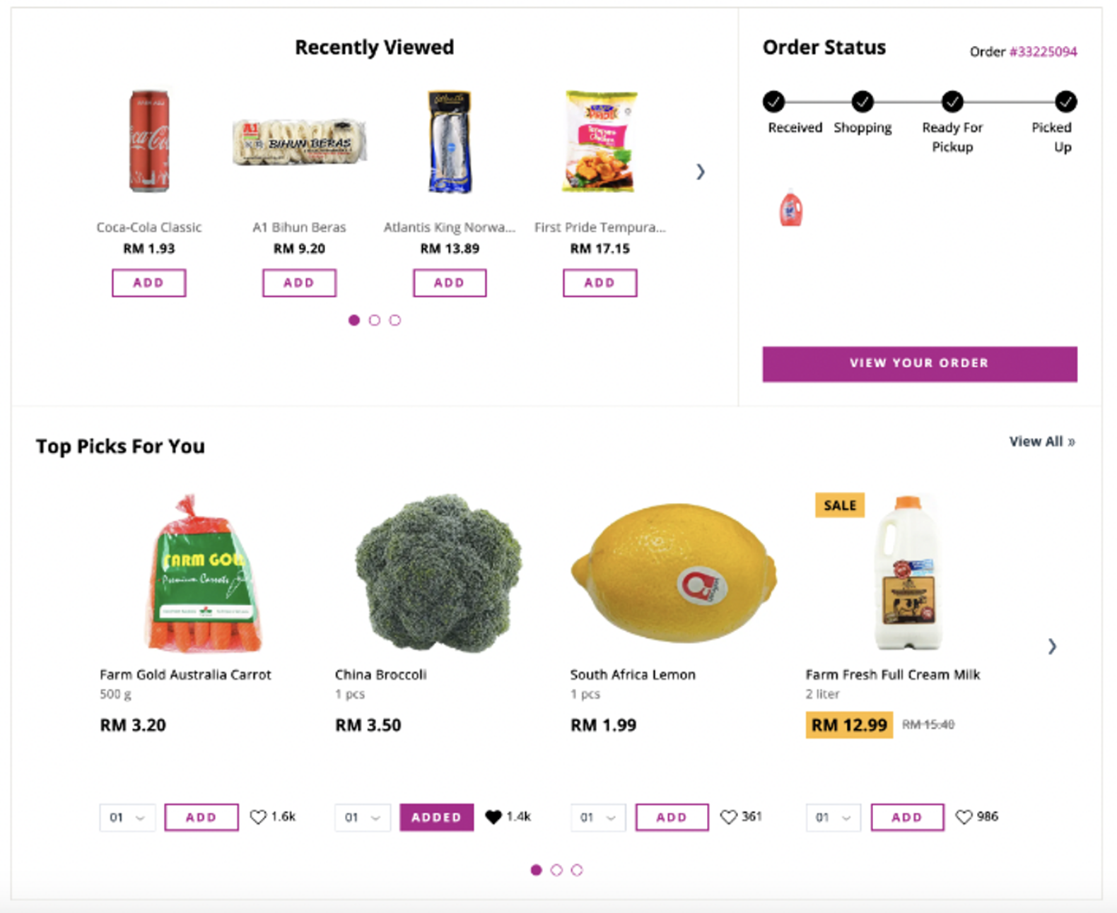
This module shows Recently Viewed, Order Status, and Top Picks that are dynamic for each customer.
The Personalized Module is only eligible on homepages.
Personalized Module: Configuration
To configure, add a row in the the Content Builder section of the page and select Custom Banner. Click in to edit.
Steps:
- To set up this module you must select the ‘Custom Banner’ module:
- From dropdown select
Custom Module Key- Add key:
personalized_module
- Add key:
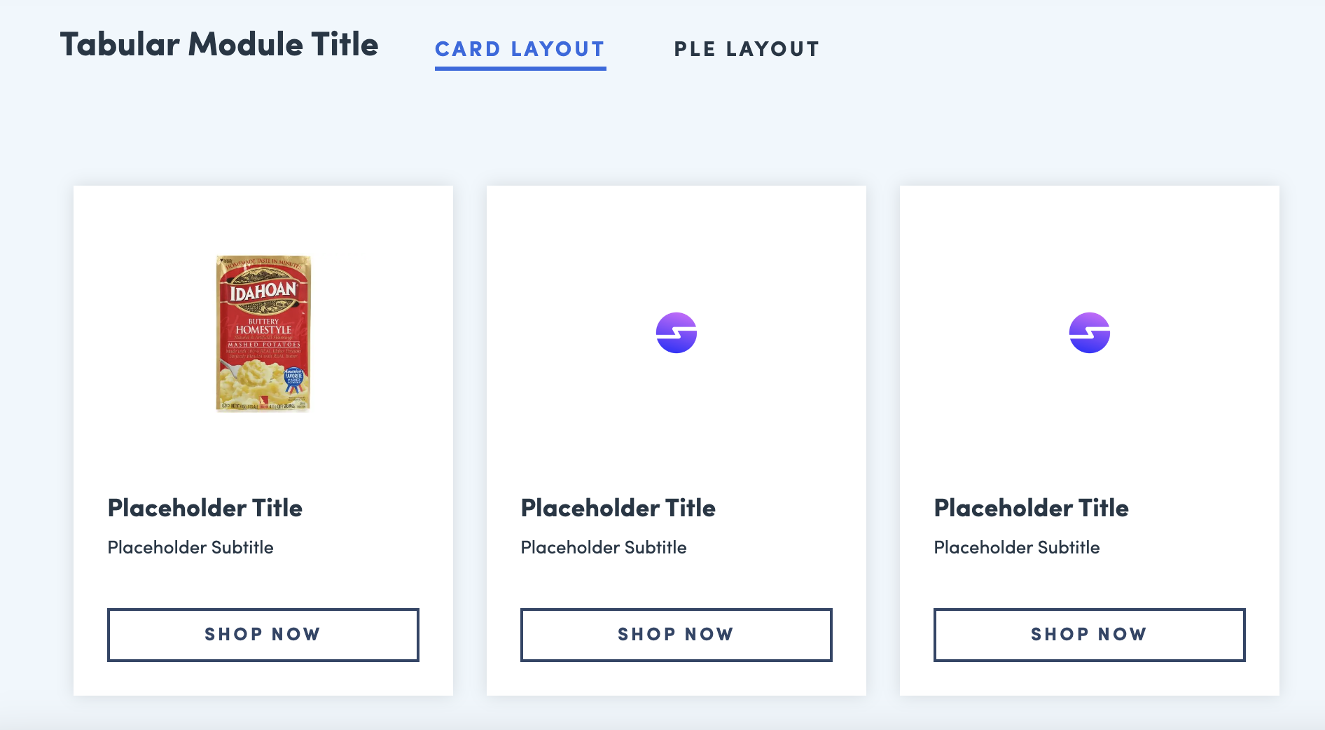
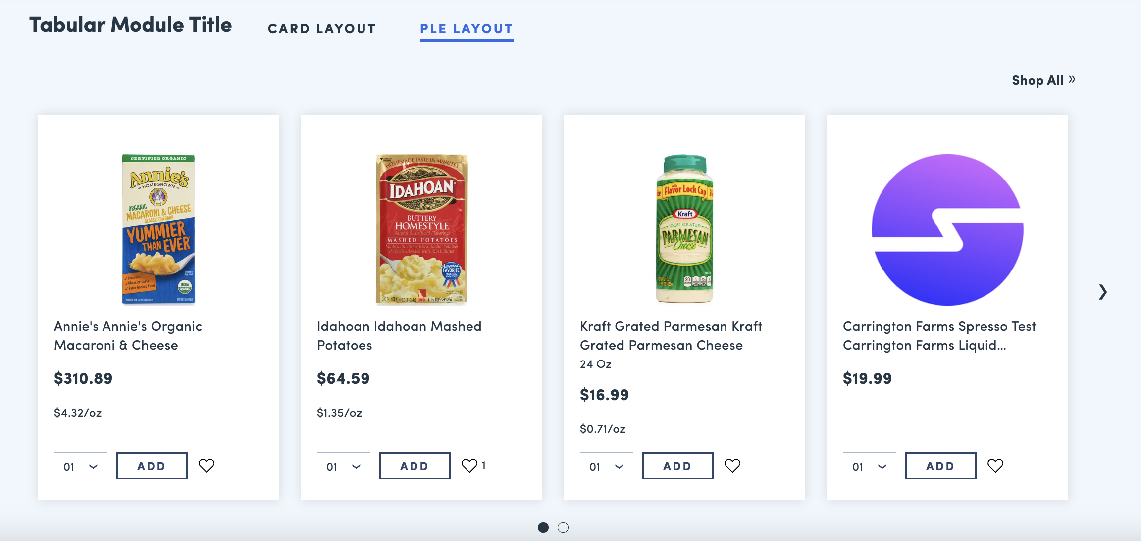
Tabular Module
Below is an example of the Tabular Module:
Card Layout:
PLE Layout:
Tabular Module: Configuration
To configure, add a row in the the Content Builder section of the page and select Tabular Module. Click in to edit.
Steps:
For all Tabs:
Title: Site facing name of entire module- Module can have up to 4 Tabs. All required fields for one tab must be populated before you can add an additional tab.
- To make any changes or delete, you must click into each individual tab
For each individual tab: Module Name: Title of individual tabModule Type: Type of tab, select either Card Layout or PLE
Card Layout:
- Press
Add Card Card Title: Add titleCard Subtitle: Add subtitleCard URL: Add URL of soft cat, landing page or product- Inputing full link will open a new tab
- Inputting link starting with
/will open in same tab
Card Copy Text: Add CTA- There are 2 slots of images:
Image 1 & 2- Use one or both depending on needs
Drag and Drop: Allows you to upload imageVariant Search: Allows you to search by GID for the product image- Type in the GID # and select the item you want to show
- Continue adding and populating cards. If more than 4 cards are added, cards will display in a carousel.
- Always press apply and save
PLE Layout:
- Select
Category Type - Search for selected category type
- Selected Soft Category or Product Category will display in the PLE
Number of results: The number of products from the selected category that will display within the tab in the form of a PLE (product list).Enable CTA Text: Select and add copy if you would like to display a CTA linking to the full category that is fueling the PLE.
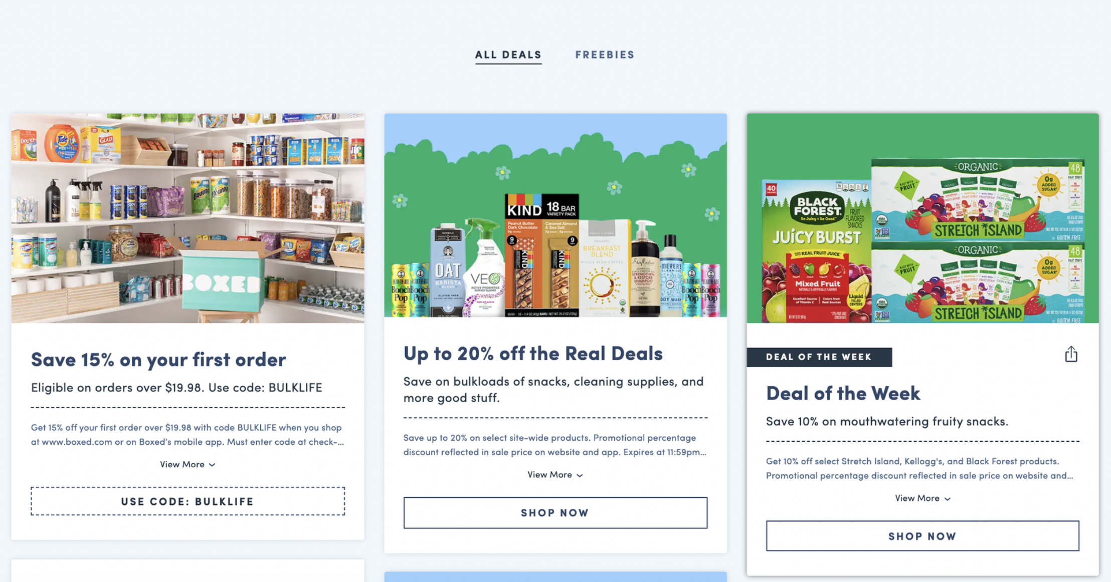
CTA List Grid Module
Below is an example of the CTA List Grid module:
CTA List Grid: Configuration
To configure, add a row in the the Content Builder section of the page and select CTA List Grid. Click in to edit.
Steps:
For all CTAs:
Module Title: Site facing title of entire module- Module can have up to 8 CTA tabs
- To make any changes or delete, you must click into each individual CTA tab
For each CTA:
Title: Site facing name of first CTA gridCTA Type: Choose link of CTACTA Reference: Search and select reference. If you chose URL as CTA Type previously, inputting full link will open a new tab. Putting in partial link after/will open in same tab.- Upload
Icon Image
CTA List Grid: Image Asset Guide
- Image: 40px x 40px
- Final Files: PNG
Featured Links Module
Below is an example of the Featured Links module:
Featured Links: Configuration
To configure, add a row in the the Content Builder section of the page and select Featured Links. Click in to edit.
Steps:
Title: Customer facing title text of the moduleSubtitle: Customer facing subtitle text of the module- Each individual link will need to be set up with the below fields to appear as a tile on the module
Link Title: Customer facing title of the individual link tileCTA Type: Select from the dropdown type and add the URL, category or soft category where the tile should linkImage: Upload desktop image. This image will be user for desktop and mobile web.Alt Text: Add an image description for ADA compliance. This can be the same as theLink Title.
- Admin can setup unlimited links
- If there are 4 or less links set up, the module will display all 4 on one screen (web)
- If there are more than 4 links set up, the module will display as a scrolling carousel (web)
Featured Links: Image Asset Guide
- Image: 380px x 266px
- Final Files: JPG or PNG
- Images should use a white background
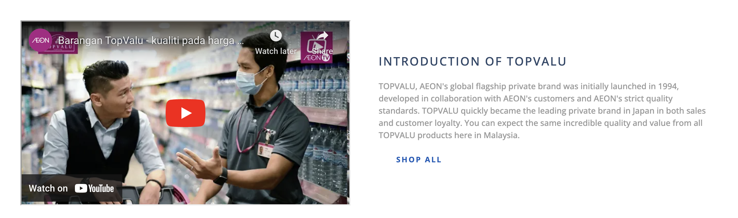
Dual Card Banner Module
Below is an example of the Dual Card Banner module:

Dual Card Banner: Configuration
To configure, add a row in the the Content Builder section of the page and select Dual Card Banner. Click in to edit.
Steps:
For all cards:
Title: Site facing title of entire module- Cards must be added in even numbers. They will stack in 1x1 format.
- To make any changes or delete, you must click into each individual card
For each Card:
Title: External customer facing text of the whole moduleTitle: External customer facing text of each moduleText Alignment: select the alignment of textSubtitle: External customer facing text of each moduleSubtitle Alignment: select the alignment of textCTA Link: inputting full link will open a new tab. Putting in partial link after/will open in same tab.CTA Text: External customer facing text of the CTACTA Alignment: select the alignment of CTAImage URL: Upload imageImage Alt Text: For voiceover
Dual Card Banner: Image Asset Guide
- Image: 767px × 500px
- Final Files: PNG or JPG
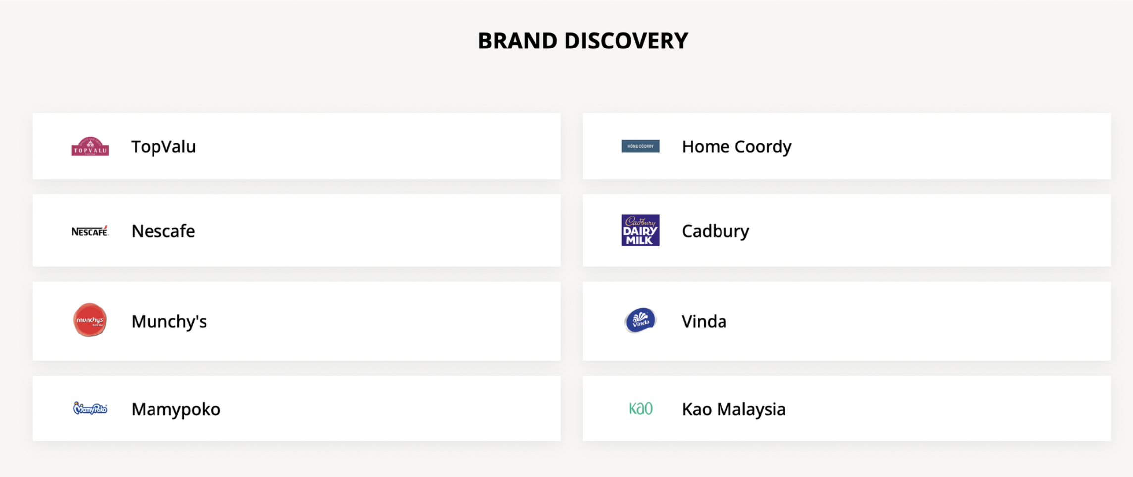
Circular Module
Below is an example of the Circular module:
The Circular module is not available on homepages.
Circular: Configuration
To configure, add a row in the the Content Builder section of the page and select Circular. Click in to edit.
- This module has a hardcoded title of
All Dealsand is intended to be used on a Deals or Promotions landing page. If you utilize the placement dropdown, separate tabs will display for each placement.
Steps:
For all cards:
Event Type: Select Promo Code, Promotion or GID- Module is intended to tie back to a marketing lever that is already set up in Foxtrot such as a promo code or promotion.
Event Type Reference: Search for the related event (promo code, promotion) in Foxtrot.Start / End Dates: Will pre-populate from the selected event, but can override if necessary.Status: Must be enabled in order for the card to display.Header Copy: Title of promo that will display on cardSub Header Copy: Subtitle of promo that will display on cardPlacement: This correlates to any tags on the cards. Selecting a placement will also group the tags together to display in an additional tab. Examples include: Freebie, Deal of the Week.Display Countdown Timer: Option to display a countdown timer on that card.- Countdown timer will reference the end date set in the card.
- Timer copy is hardcoded:
Hurry! Ends in XX:XX:XX:XX
CTA Link Type:- Enter full URL Link. Need full link for social sharing
- If your event type is
Promo Codewith theCodeas the Event Type Reference, you can choose to have your CTA Link Type bePromo Code. That means that the card does not have a URL and will show the code instead. - If your event type is
GID, you can have your CTA Link Type beGID.
- If your event type is
- Enter full URL Link. Need full link for social sharing
T&Cs: Enter T&Cs for the given promotionImage: Add ImageAlt Text: Used for voiceover. Can be the same as header copy.
Circular: Image Asset Guidelines
- Image: 716px x 424px
- Final Files: JPG
Circular: Tips
- You can drag card positions on the left side. The order of the cards is how they show on site.
- In the case where you want to set up this module before the related promotion is created, you can create a generic placeholder promotion as a workaround and manually add in the necessary dates and link.
IFrame Block Module
This module can be used to embed an iframe on a page. Below is an example:
Please note: preview within Foxtrot is not supported for this module, however the iframe will display correctly when using the “Preview” button.
IFrame Block: Configuration
To configure, add a row in the the Content Builder section of the page and select IFrame Block. Click in to edit.
Steps:
- Iframe Source: copy paste iframe source code in this field
Image Block Module
Below is an example of the Image Block module. While this module can be used in a single column layout, it is intended to be used next to a Content Block to add context to the image.
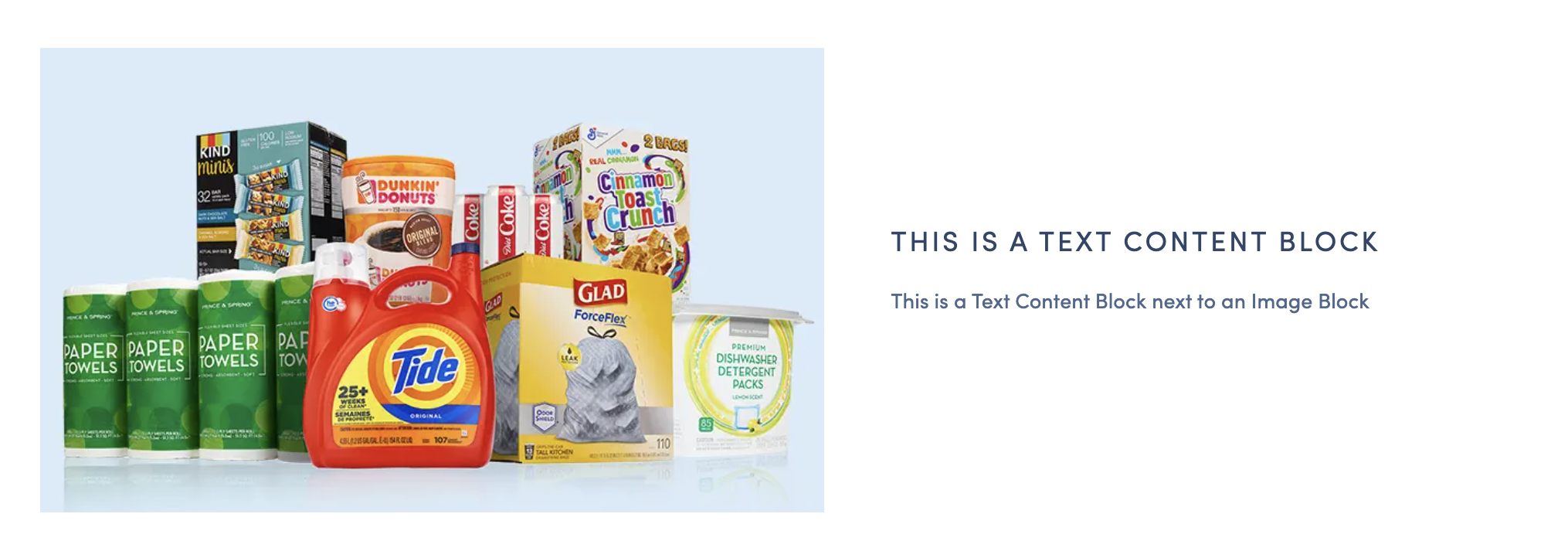
Image Block: Configuration
To configure, add a row in the the Content Builder section of the page. On the left side of the row, select Column Layout and choose two. Click into either column and select Image Block. Click in to edit.
Steps:
CTA Type: select the type of link for CTA. This is optional if you would like the image to click into a secondary page.CTA Reference: Search and select reference. If you chose URL as CTA Type previously, inputting full link will open a new tab. Putting in partial link after/will open in same tab.Background image: upload image for desktopMobile CTA Type: select the type of link for CTA (optional)Mobile Aspect Ratio: should always be2:3Mobile Image: Upload image (use same image in all three image sections)Tablet Aspect Ratio: should always be3:2Tablet Image: Upload image (use same image in all three image sections)
Image Block: Image Asset Requirements
- Image: 534px x 300px
- Final File: PNG or JPG
Text Content Block Module
Below is an example of the Text Content Block module. This is a flexible text only module that can be used alone or in a double column next to an Image Block or Iframe. It is optional to add a link.

Text Content Block: Configuration
To configure, add a row in the the Content Builder section of the page and select Text Content Block. Click in to edit.
Steps:
Alignment: Select text alignment for the module. Options are Left, Center and Right. By default this will be Left aligned.Title: External customer facing text. All text will be capitalized.Content: External customer facing textLink Text: External customer facing CTA text. This is optional.Link Action: Input URL of link. This is optional.Mobile CTA Type: select the type of link for CTA. This is optional.
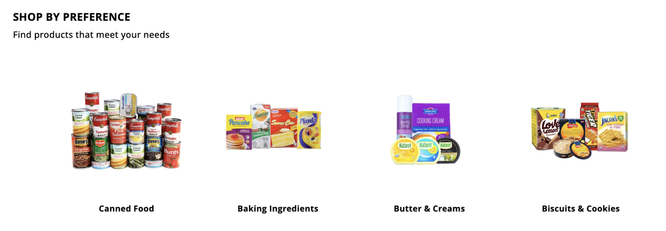
Product List Entity Module
Product List Entities (known as PLE’s) are list views of products from select categories or soft categories. The product display is the same that you would see on a category page.
Below is an example of a Product List Entity:
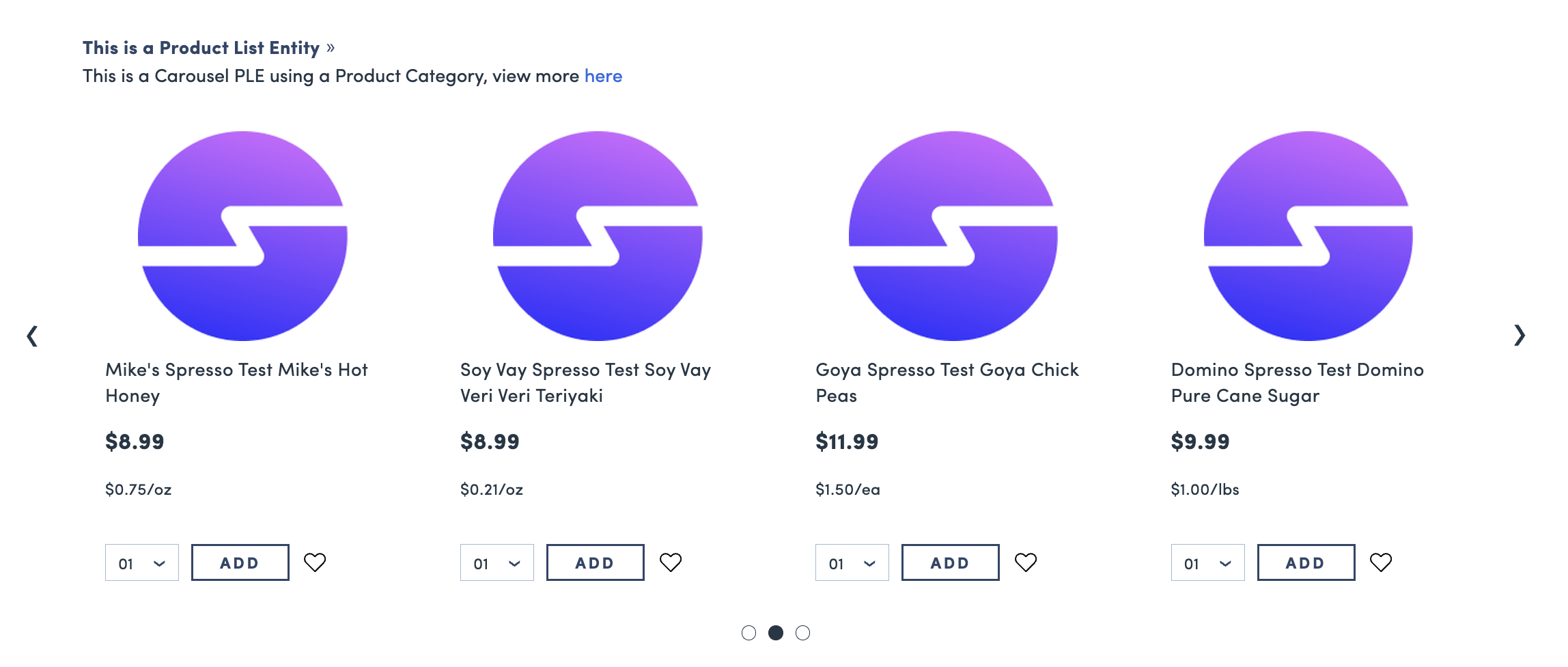
Product List Entity: Configuration
To configure, add a row in the the Content Builder section of the page and select Product List Entity. Click in to edit.
Steps:
Category type: select which type of category this module will pull fromCategory/Soft Category: search from existing category or soft categoryLayout Type: Select from default view or carousel view- default: displays as a gallery list
- carousel: scrolling carousel of products
Number of results: best to input increments of 4Title: External customer facing textSubtitle: external customer facing textCTA Type: Choose type of link for CTACTA Reference: Search and select reference. If you chose URL as CTA Type previously, inputting full link will open a new tab. Putting in partial link after/will open in same tab.Enable CTA Text: Show CTA text on top right of the moduleEnable Add All To Cart: Show 'Add All to Cart' CTA for customers. This is not eligible on homepage PLEs.Enable pagination: For modules with default view, you can enable pagination that shows "Load More" CTA
Hero Banner Modules
- Hero Banners consist of Landing Hero Banners, Brand Hero Banners, and Blog Post Headers. These modules are all configured the same way but the name varies depending on the page type.
- Hero Banners can only be added as the first module on a landing page, brand page, or blog page
Hero Banners: Configuration
To configure, add a row in the the Content Builder section of the page and select Landing Hero Banner, Brand Hero Banner, or Blog Post header depending on your page type. Click in to edit.
Steps:
Type: Select whether the banner is on a landing page or brand page, etc.- This will be pre-populated based on module selection (Example: Landing Hero Banner or Brand Hero Banner)
Title: External customer facing text of the bannerSubtitle: External customer facing textTitles Text Color: Configure the color of the textLink Text: External customer facing text of the CTALink Action: Input in URL to link customers to another page. Suggestion is to input in#b-mod-3to tab the user down the pageBackground Color: configure the background of the bannerBackground Image: upload banner image for web- Final File: JPG or PNG
Mobile Image: Not required - leave blank. Mobile web will display the center section of the desktop image.Tablet Image: Not required - leave blank. Tablet web will display the center section of the desktop image.
Her Banner: Image Asset Requirements
- Hero images are compressed to 150kb. If the image uploaded image is > 150kb, you may notice a difference in quality. To avoid this, you will need to optimize these images to reduce file size without compromising image quality. Some ways this can be done is by using JPEGs instead of PNGs, and also removing metadata from images.
Landing Hero Banner:
- Desktop: 1500px x 250px
- Mobile image is not required. Mobile web will display the center section of the desktop image.
- Final Files: JPG or PNG
- Leave space in the middle for text + CTA

Brand Hero Banner:
- Desktop: 1500px x 300px
- Mobile image is not required. Mobile web will display the center section of the desktop image.
- Final Files: JPG or PNG
- Leave space in the middle for text + CTA
Blog Post Header:
- Desktop: 1500px x 350px
- Mobile image is not required. Mobile web will display the center section of the desktop image.
- Final File: JPG or PNG

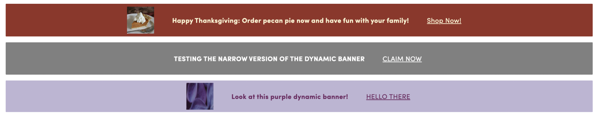
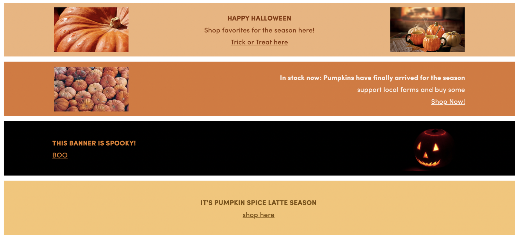
Dynamic Full Width Banner Module
- The Dynamic Full Width Banner can be used on Homepages, Landing Pages or Brand Pages. It consists of two sizes (75px height and 150px height) and spans the full width of the page.
- This banner is dynamic in that it supports multiple text alignments, customizable text color, and 3 different background types (hex code, hex code with icons, and full image) to support different marketing and messaging needs.
Below are examples of the Narrow Banner:
Below are examples of the Tall Banner:
Dynamic Full Width Banner: Configuration
To configure, add a row in the the Content Builder section of the page and select Dynamic Full Width Banner. Click in to edit.
Steps:
Banner Height: Select from the two options. Form fields are dynamic based on selected the height.
Narrow Banner: 75px height
- Specs:
- 1200 x 75 on desktop web
- 375 x 75 on mobile web
- Copy will always be centered in this version
- This version will not support subhead copy
- Desktop copy will always sit on one line in this version
Header Copy: Customer facing copy displayed in the module- Header copy has a max of 72 characters, wraps on mobile after 50 characters
Copy Color:Hex code color for all copy displayed in the bannerCTA Copy: Customer facing copy used as a call to action- CTA copy has a max of 20 characters
- CTA copy is optional, If CTA copy is not added in Foxtrot, it will not display
- If CTA copy is not added, the banner can not link out to open another page
CTA Type&CTA Reference:Select from the type dropdown and add the URL, category or soft category where the CTA should link.- If this is not filled out, CTA will neither display nor function on web.
Background Type:- Full Image Background:
Image (1200x75):Upload 1200 x 75 image that will cover the full background on web- Copy added will sit directly on top of this image, the user will need to make sure they use an image with proper spacing
- Mobile web will size into the middle of the image
Alt Text: Image Description: Add an image description for ADA compliance
- Hex Code Background:
Background Color (Hex Code): Add hex code of color that should fill the entire container of the banner for a background
- Hex Code Background + Left Icon:
Background Color (Hex Code): Add hex code of color that should fill the entire container of the banner for a backgroundLeft Icon (60x60): Upload 60x60 icon image that will sit on top of the hex code background on the left side of the banner- Icon Image will scale down to 30x30 on mobile web
Alt Text: Left Image Description: Add an image description for ADA compliance
- Full Image Background:
Tall Banner: 150px height
- Specs:
- 1200 x 150 on desktop web
- 375 x 150 on mobile web
- This version can support different text alignment as well as subhead copy
Header Copy: Customer facing copy displayed in the module- Header copy has a max of 72 characters
Subheader Copy: Customer facing subcopy displayed in the module- Subheader copy is optional
- Subheader copy has a max of 72 characters
Header Copy Alignment: Alignment of header and subheader copy within the banner. This can be centered, left aligned, or right aligned.- Header + subhead will always share alignment
- This field is not supported with certain background types
Copy Color:Hex code color for all copy displayed in the bannerCTA Copy: Customer facing copy used as a call to action- CTA copy has a max of 20 characters
- CTA copy is optional, If CTA copy is not added in Foxtrot, it will not display
- If CTA copy is not added, the banner can not link out to open another page
CTA Copy Alignment:Alignment of CTA copy within the banner. This can be centered, left aligned, or right aligned.- CTA alignment can only differ from Header Copy alignment on desktop web. On mobile web, CTA will always be aligned with the rest of the copy
- CTA cannot be centered if header is left-aligned or right-aligned
- This field is not supported with certain background types
CTA Type&CTA Reference:Select from the type dropdown and add the URL, category or soft category where the CTA should link.- If this is not filled out, CTA will neither display nor function on web.
Background Type:- Full Image Background:
Image (1200x150):Upload 1200 x 150 image that will cover the full background on web- Copy added will sit directly on top of this image, the user will need to make sure they use an image with proper spacing
- Mobile web will size into the middle of the image
Alt Text: Image Description: Add an image description for ADA compliance
- Hex Code Background:
Background Color (Hex Code): Add hex code of color that should fill the entire container of the banner for a background
- Hex Code Background + Icons (centered text):
Background Color (Hex Code): Add hex code of color that should fill the entire container of the banner for a backgroundLeft Icon (200x120): Upload 200x120 icon image that will sit on top of the hex code background on the left side of the banner- For this version, images will not display on mobile web
Alt Text: Left Image Description: Add an image description for ADA complianceRight Icon (200x120): Upload 200x120 icon image that will sit on top of the hex code background on the right side of the banner- For this version, images will not display on mobile web
Alt Text: Right Image Description: Add an image description for ADA compliance- This background will force all text to be centered
- Hex Code Background + Left Icon (right-aligned text):
Background Color (Hex Code): Add hex code of color that should fill the entire container of the banner for a backgroundLeft Icon (200x120): Upload 200x120 icon image that will sit on top of the hex code background on the left side of the banner- Icon Image will scale down to 100x60 on mobile web
Alt Text: Left Image Description: Add an image description for ADA compliance- This background will force all text to be right aligned
- Hex Code Background + Right Icon (left-aligned text):
Background Color (Hex Code): Add hex code of color that should fill the entire container of the banner for a backgroundLeft Icon (200x120): Upload 200x120 icon image that will sit on top of the hex code background on the right side of the banner- Icon Image will scale down to 100x60 on mobile web
Alt Text: Left Image Description: Add an image description for ADA compliance- This background will force all text to be left aligned
- Full Image Background:
Dynamic Full Width Banner: Image Asset Guidelines:
Narrow Banner:
- Full Background Image: 1200x75
- Icon Image: 60x60
- Final Files: PNG
Tall Banner:
- Full Background Image: 1200x150
- Icon Image: 200x120
- Final Files: PNG
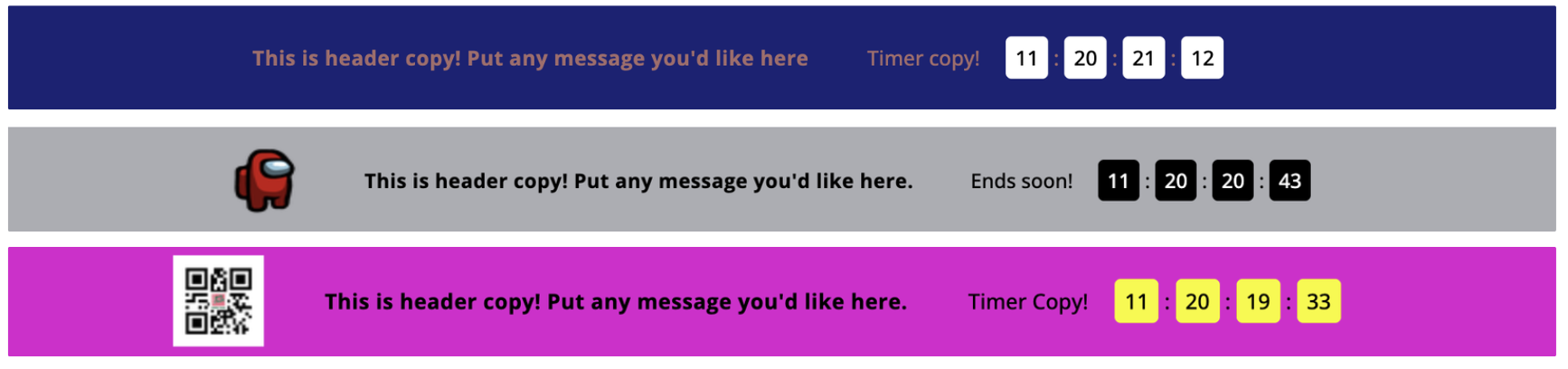
Countdown Banner Module
The Countdown Banner Module includes a countdown timer based on a custom end date and can be used on Homepages, Landing Pages or Brand Pages.
- The module is 75px height and spans the full width of the page on desktop and mobile web. It includes configurable colors, text and an optional icon image.
Below are examples of the Countdown Banner Moduke:
Countdown Banner: Configuration
To configure, add a row in the the Content Builder section of the page and select Countdown Banner. Click in to edit.
Steps:
Countdown End Date: The date and time that the countdown will reference. Once this date is met, the banner will no longer display on web.Header Copy: The main customer facing copy displayed in the module.- Header copy has a max of 70 characters, wraps on mobile web after 50 characters.
- On desktop web, this will always display on one line.
Timer Copy: This is additional copy that will display directly next to the timer. ie, ‘Ends in’.- Timer copy has a max of 12 characters.
Copy Color: Hex code to be used for all text copy in the banner.Timer Digits Color: Hex code to be used for the digits in the timer.Timer Card Color: Hex code to be used for the background card color of the timer.CTA Type&CTA Reference:Select from the type dropdown and add the URL, category or soft category where the module should link.- If this is not filled out, the module will not clickthrough to another page.
Background Type:- Hex Code Background:
Background Color (Hex Code): Add hex code of color that should fill the entire container of the banner for a background.
- Hex Code Background + Left Icon:
Background Color (Hex Code): Add hex code of color that should fill the entire container of the banner for a backgroundLeft Icon (60x60): Upload 60x60 icon image that will sit on top of the hex code background on the left side of the banner- Image can be PNG or JPG
- Icon Image will scale down to 30x30 on mobile web
Alt Text: Left Image Description: Add an image description for ADA compliance
- Hex Code Background:
Countdown Banner: Image Asset Guidelines
- Icon Image: 60x60
- Final Files: PNG or JPG
Markdown Text Block Module
The Markdown Text Block is only supported for Text Content Pages
- This module allows you to create text content and supports formatting such as headings, lists, links etc
- It uses Markdown, which is a lightweight markup language that uses plain text formatting to create formatted documents
- A guide to Markdown syntax can be found on this page: https://www.markdownguide.org/basic-syntax/
- Please note that we do not support all Markdown syntax, see Supported Syntax section below
Markdown Text Block: Supported Syntax
- Headings
- h1
- h2
- h3
- h4
- h5
- h6
- Text formatting
- Regular text
- Italicized text
- Bold text
- Numbers list
- Bullet point list
- Tables
- Links
- Anchors
- 📣 Only supported for headings
- External Images (e.g. public images from web)
- 📣 Image upload is not currently supported
Modules: Additional Information
- To link to a module on the same page use
#b-mod-[x]x being the number of the module on the page that you want to drop down to. - User can duplicate, drag and drop, or delete a module row through the left side bar of each row.
Updated over 1 year ago