
Configurable PDP
As a Foxtrot admin user I am able to configure the PDP layout to apply for all products on web and desktop web.
Overview
The Configurable PDP feature allows admin users to manage, customize and make changes to their product display page without the need for technical development.
- This feature provides differentiated product display layouts and offerings from which clients can choose.
- The live Product Display Page will be the layout for all variant GIDs on site.
- PDP Modularization impacts Web + Mobile web only (changes are not on iOS or Android app).
This feature supports the below layout options:
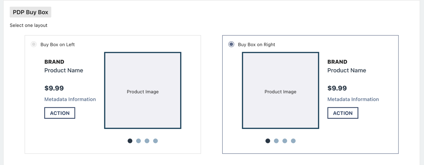
Buy Box Placement - Layout Options
Buy Box on the Right
- If this is selected, Images will be on the left side of the PDP
Buy Box on the Left
- If this is selected, Images will be on the right side of the PDP
Note: There is no impact to the content or function within the Buy Box, the only change is the option of where it is placed on the page.
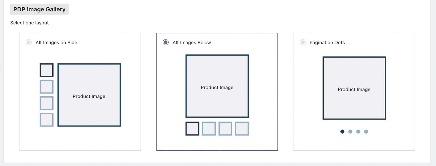
Display of Main Images & Alt Images - Layout Options
Alt Images on Side
- If Buy Box on the Right is selected, Alt Images on Side will always be on the left side. If Buy Box on Left is selected, Alt Images on Side will always be on the right side
- This version displays up to 3 thumbnail images at a time and arrows to scroll through the full gallery of thumbnails. If there are 3 or less product images, the arrows will not appear.
- On mobile web, alt images thumbnails will display below the PDP image
Alt Images Below
- This version displays up to 5 thumbnail images at a time and arrows to scroll through the full gallery of thumbnails. If there are 5 or less product images, the arrows will not appear.
- On mobile web, alt images thumbnails will display below the PDP image
Pagination Dots
- This version displays pagination dots below the main image corresponding to the number of product images. Users can either click the pagination dots or scroll through the arrows next to the main image to view the full image gallery.
- On mobile web, pagination dots will display below the PDP image
Display of PDP Tabs - Layout Options
This feature does not change the content within the PDP tabs or the logic behind which tabs are displayed, but instead gives the user flexibility on how the tabs are displayed.
- Tabs will always reference the content from Details, Seller, Shop By, Explore and Recommended.
- A max of 4 tabs will ever show on one PDP.
- The Seller tab will only show if Marketplace items are available and will replace the Shop By tab.
User can select the below options:
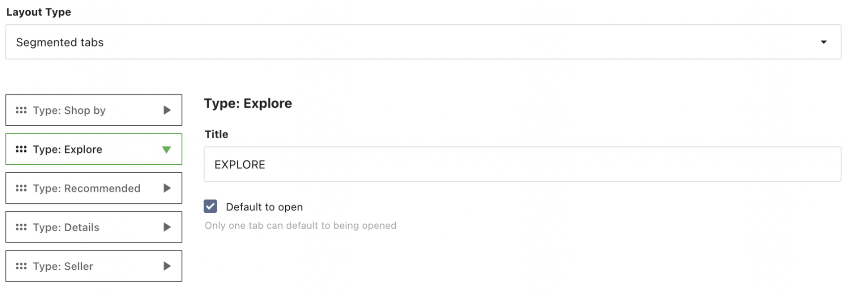
Segmented Tabs
- These are individual tabs that when selected span the full width of the page. Only one segmented tab can be open at a time.
Collapsible Accordion Tabs (Half Page)
- These are expandable tabs that sit directly below the product images.
- The buy box will remain sticky as the user scrolls down.
- The buy box will follow the user down the page until reaching the footer allowing the user to add the item to cart as they explore the content within the tabs.
- Buy box will only be sticky on desktop, not on tablet/mobile breakpoints.
Collapsible Accordion Tabs (Full Page)
- These are expandable tabs that span the full width of the page directly below both the product images and the buy box.
Additional customizations:
- User can select the order of the tabs
- User can override the display name of the tabs
- ie, can update EXPLORE to EXPLORE [Your company name]
- User can select which tab defaults as open
- Segmented tabs support 1 open tab
- Accordion tabs support 1-4 tabs being open
- One tab must always be open
- Regardless of selection, tabs on mobile web will always be collapsible
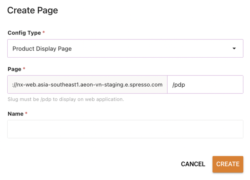
Pages: Product Display Page
Configurable PDP is managed in Foxtrot within Pages.
- We recommend restricting access to this feature and limiting the amount of pages created to reduce any potential user errors.
User can add a new Product Display Page or edit an existing one
- Only one Product Display Page can be live on site a time. If there are multiple active pages, the page with the most recent start date will take precedent.
- The live Product Display Page will be the layout for all variant GIDs on site.
- User can view existing Product Display Pages via the Config Type filter on the left side of the list view
- The
Config Type: Product Display Pagewill be used to configure the layout of the organization’s storefront PDP.
- The
Configuration: Product Display Page
Config Type: must be Product Display PagePage URL/slug: This must be set to /pdp or else the configuration will not render.Name: Internal identifier of the page. This name will show in the list view. recommend that you do not use the same name for multiple pages.
Once page is created, user can select:
PDP Buy Box Layout: Buy Box on Left or Buy Box on Right
- User will select via radio button
- Default selection will be Buy Box on Right as that is the out of the box PDP
PDP Image gallery: Alt Images on Side, Alt Images Below or Pagination Dots
- User will select via radio button
- Default selection will be pagination dots as that is the out of the box PDP
- If
Buy Box on Rightis selected,Alt Images on Sidewill always be on the left side. IfBuy Box on Leftis selected,Alt Images on Sidewill always be on the right side
PDP Tabs Layout: Segmented Tabs, Collapsible Accordion Tabs (half page) or Collapsible Accordion Tabs (full page)
- User will click in to edit
- Default selection will be Segmented Tabs as that is the out of the box standard PDP
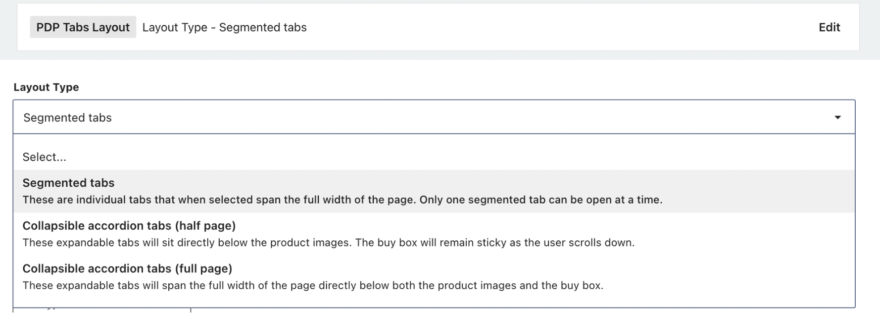
- We will not be changing the content within these tabs or how they pull in their content, but user can configure how they are displayed. Tabs will always reference the content from Details, Seller, Shop By, Explore and Recommended. A max of 4 tabs will ever show. The Seller tab will only show if Marketplace items are available and replace the Shop By tab.
User can configure the order of tabs and control which defaults to open
- If
Segmented Tabsis selected, only one tab can default to open - If either
Collapsible Accordion Tabsis selected, up to 4 tabs can be defaulted to open
User can configure the name to display on the tabs
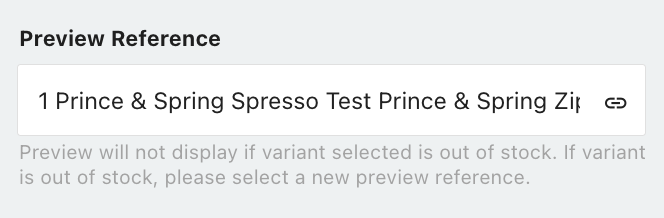
Product Display Page: Preview Reference
User can set a Preview Reference to preview their layout before publishing.
- The default preview reference will be first variant in an organizations catalog that is in an active state.
Updated over 1 year ago